
In my experience across various web development projects, writing automated tests for UI components is often left aside in favor of other types of tests. And in extreme cases, where tests are a luxury that the project cannot afford, new features get prioritized over any kind of tests.
Then, a style change in one part of the app breaks something else entirely and it reaches production unnoticed because no one thought it would. That’s just how CSS works. There’s many approaches to encapsulate the mysterious ways of CSS and each of them has its own shortcomings, but that’s a subject for another post.
Today I’ll focus not on preventing components from breaking, but on detecting that they broke before it becomes a problem.
The scenario
Imagine a simple React Component that renders a button.
TheButton.jsx
const TheButton = ({ text, onClick, disabled }) => (
  <button className="red-button" onClick={onClick} disabled={disabled}>
    {text}
  </button>
);
some-css-file.css
.red-button {
  padding: 12px 4px;
  backgroundcolor: #dc2626;
  border-radius: 4px;
}
The typical unit test for this component would assert that the onClick callback gets called when it should, that the button renders the correct text and that it becomes disabled when specified. A thorough tester could also check that the red-button class gets added to the button… but there’s no guarantee that the red-button class actually styles the button the way we need it to. We could check that too. I’m not advocating for it, though: it’s both time consuming and error prone to test that every rule is applied to the button. We need another way to check that on every new change to the codebase, only the components that we want changed actually change.
The solution
At my current project, our solution was screenshot testing.
We looked through a few tools and found exactly one that did what we needed: Viteshot. The fact that it was relatively hard to find inspired this post. After that, it was all pretty straightforward. Their Getting Started page is easy to follow, and after the initial configuration, for each component, you simply create one or more files that specify the states you want to render.
TheButton.screenshot.jsx
import "src/some-css-file.css"; // Remember to import the CSS 🙂

export default () => (
  <>
    <TheButton>Normal</TheButton>
    <TheButton disabled>Disabled</TheButton>
  </>
);
The viteshot command then generates a png image with the render result for each of the files.
If you commit the image files, they’ll appear on pull requests to make sure that no unintended style changes get through code review.
To keep things performant, we use Git Large File Storage, but that’s not a requirement if you have just a few components.
Now, automate it
It’s tiresome to run a command every time you open or update a pull request. And you can always forget to run it, which leads to the very same problems we’re trying to solve. That’s why shortly after the initial solution (read that as “the next day”, we really hate doing things manually) we created a GitHub Action to take the screenshots for us.
I’ll walk you through our thought process. The action should run when we push to a branch, but what should it do?
- Check out the branch code.
- Install our dependencies
- Run Viteshot, which generates the images.
- Commit the images to the branch.
The trickiest step is the last one. To achieve this, we’re using the fantastic Git Auto Commit Action by Stefan Zweifel. To set it up, we need to create a Github Personal Access Token and set it in the repo’s secrets. It’s all explained in the action’s README page.
The finished action looks like this:
.github/screenshot.yml
name: "screenshot"
on: [push]
jobs:
  screenshot:
    name: Runs Viteshot and takes component screenshots
    runs-on: ubuntu-latest
    steps:
      - name: Checkout code
        uses: actions/checkout@v2
        with:
          token: ${{ secrets.GH_PERSONAL_ACCESS_TOKEN }}

      - name: Install dependencies
        run: npm ci

      - name: Run Viteshot
        run: npm run viteshot # we added the viteshot command to our scripts in package.json

      - uses: stefanzweifel/git-auto-commit-action@v4
        with:
          commit_message: Update component screenshots (Committed by GitHub Action)
Bonus track: Dark mode styles
This one will not apply to all use cases, but it showcases the customization potential that Viteshot has. At our project we support both light and dark mode, so every component has twice as many styles that need to be checked.
Using the wrapper option, we now render them both in the same image. The wrapper simply renders the children twice.
viteshot.config.js
module.exports = {
  …
  wrapper: {
    path: '__viteshot__/ScreenshotWrapper.tsx',
    componentName: 'Wrapper',
  },
};
ScreenshotWrapper.tsx
export const Wrapper = ({ children }) => (
  <div style={{ width: 1366, height: 768 }}>
    <div
      className="flex flex-wrap items-center justify-center gap-2 bg-white"
      style={{ height: 384 }}
    >
      {children}
    </div>
    <div
      className="dark flex flex-wrap items-center justify-center gap-2 bg-black"
      style={{ height: 384 }}
    >
      {children}
    </div>
  </div>
);
We’re using TailwindCSS for the styles, in case you’re not familiar with the syntax. The
darkclass on the second container triggers dark mode inside of it.
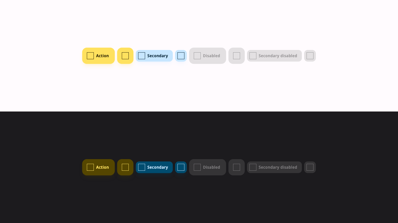
This is the resulting screenshot for one of our button components.
Conclusion:
Screenshot testing is not by any means a perfect solution, but we found that both the initial setup cost and the subsequent maintenance costs are very low compared to other options we considered. It does not fulfill the need to test the actual behavior of components, but it does add a safety net to prevent styles from breaking when you push new code. Now we can focus more confidently on higher value tasks instead of chasing elusive style inconsistencies.
As far as the tool goes, Viteshot offers plenty of options to suit different needs. Dark mode was just one example, but you can also specify screen sizes or test hover/focus states, for example.
Writing robust styles is not easy, but when done right, it’s possible to make a codebase stand its ground against this old joke.
Two CSS properties walk into a bar. A barstool in a completely different bar falls over. — Thomas Fuchs