
Recently, I had to implement a responsive pricing table for our remote retrospectives app, RetroAlly. Since large tables don’t work well on small screens, the desktop and mobile wireframes for it were quite different. The obvious approach would be to duplicate the markup and just implement it twice. However, I saw an opportunity for the challenge of making it fully responsive using CSS Grid, with no duplicated markup. It started as an experiment, but I’m really satisfied with how it turned out.
In this article I’ll walk you through the step-by-step implementation of a similar table, albeit a much smaller one, with the same approach I used for the real one.
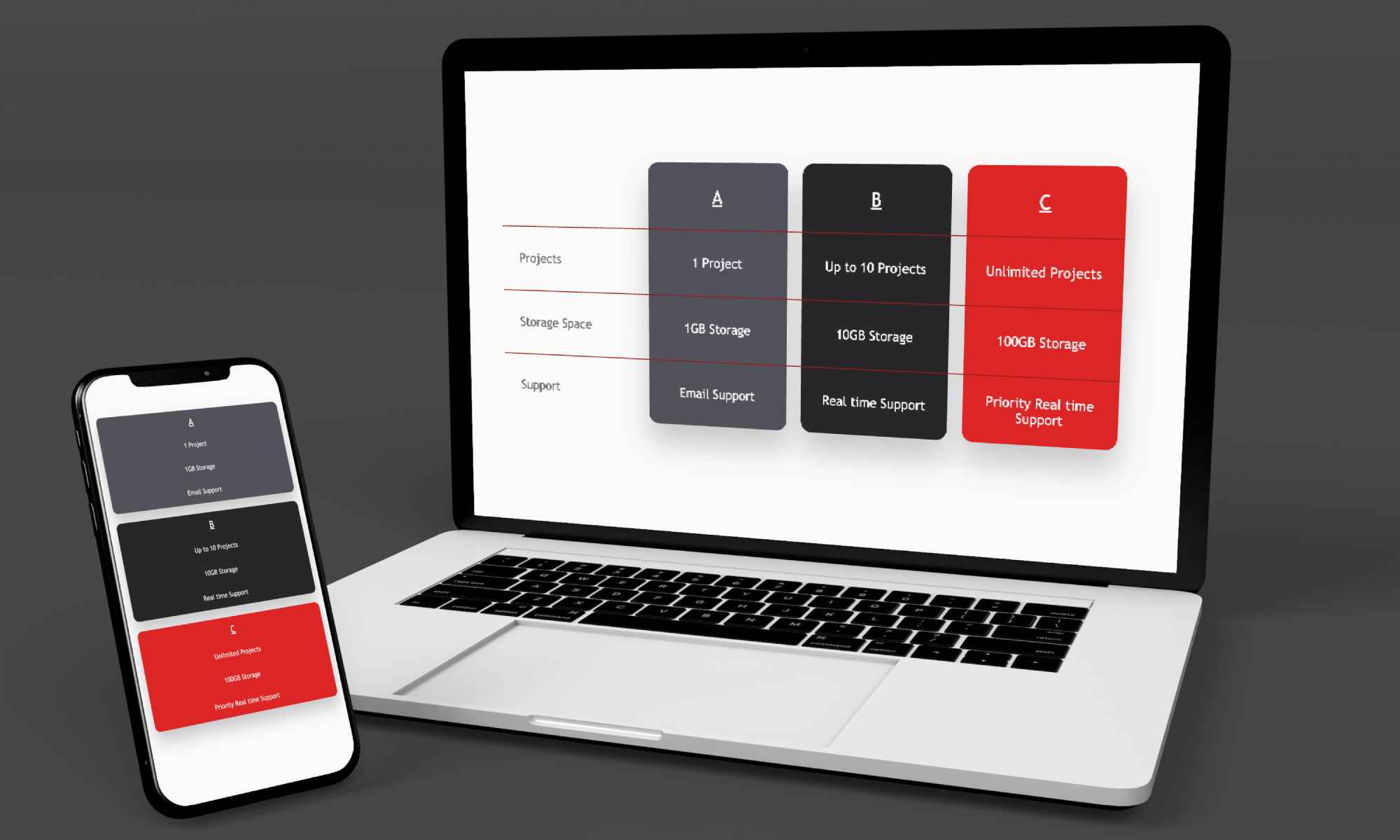
Here’s how it’s supposed to look, both in desktop and mobile views:
Let’s get started
The hypothetical service we want to display pricing for has three plans (Plans A, B and C) with different features on three areas: _Projects, Storage Space and Support.
Here’s the basic table structure:
<table>
  <thead>
    <tr>
      <td></td>
      <td>A</td>
      <td>B_</td>
      <td>C</td>
    </tr>
  </thead>
  <tbody>
    <tr>
      <td>Projects</td>
      <td>1 Project</td>
      <td>Up to 10 Projects</td>
      <td>Unlimited Projects</td>
    </tr>

    <tr>
      <td>Storage Space</td>
      <td>1GB Storage</td>
      <td>10GB Storage</td>
      <td>100GB Storage</td>
    </tr>

    <tr>
      <td>Support</td>
      <td>Email Support</td>
      <td>Real time Support</td>
      <td>Priority real time Support</td>
    </tr>
  </tbody>
</table>
The Grid
Since we’ll be using CSS grid, we’ll need the data cells to be direct descendants of the table element. Thanks to the display: contents CSS property, we can fake this without compromising accessibility. Unless we need to support Internet Explorer, of course, but for the sake of a simple example, I’ve just decided we don’t need to do so.
I added class="contents" to every thead, tr and tbody element, then added these rules to my stylesheet.
.contents {
  display: contents;
}

table {
  display: grid;
  grid-template-columns: repeat(4, 160px);
  grid-template-rows: repeat(4, 70px);
}
I also added some extra styling so our table looks nicer, but none of it is essential to the incoming responsiveness. Here’s what it looks like at this stage:
Overlapping elements with grid-area
In the designs, there’s a card for each of the plans. Using a non-grid table, positioning the cards would be a nightmare, since the HTML markup groups the elements in rows, not columns. There’s no element that represents a single column and thus styling it becomes pretty complex.
CSS Grid to the rescue! With CSS Grid you can define grid-areas within a grid, then assign elements to each area. The interesting part is that if you assign multiple elements to the same cell, they will overlap.
Adding a new rule to the table selector to define the grid areas:
table {
  grid-template-areas:
    ".            header-a  header-b  header-c"
    "row1-header  row1-a    row1-b    row1-c"
    "row2-header  row2-a    row2-b    row2-c"
    "row3-header  row3-a    row3-b    row3-c";
}
Grid areas can have varying sizes. In this use case, each area takes only one cell.
Then each cell gets assigned to its area, for example, the header for Plan A:
<td style="grid-area: header-a">A</td>For the sake of simplicity, I’ll be using inline styles to assign each cell to its grid-area. The usage of inline styles is usually discouraged.
The cards will be presentation-only elements (there’s no impact on accessiblity thanks to the role="presentation" or role="none" attribute).
<table>
  <thead>
    <!--  column (card) presentation elements  -->
    <tr role="none" class="contents">
      <td id="card-a" class="card" />
      <td id="card-b" class="card" />
      <td id="card-c" class="card" />
    </tr>
    <!-- rest of thead -->
    ...
  </thead>
  <!-- table body -->
  ...
</table>
To position the cards, we just need to set their grid-row and grid-column properties (or the shorthand grid-area, but I prefer the former). Each card starts on their respective header, and spans four rows and one column.
#card-a {
  grid-row: header-a / span 4;
  grid-column: header-a / span 1;
}

#card-b {
  grid-row: header-b / span 4;
  grid-column: header-b / span 1;
}

#card-c {
  grid-row: header-c / span 4;
  grid-column: header-c / span 1;
}
For the lines between rows, I’ll use the same principle. Three separator elements will be positioned on each of the three row headers. After we have row presentational elements, we can style them however we wish. In this case, just a simple border-top will do the trick (not shown in the code snippet).
<!--  row (separator) presentation elements -->
<tr role="none" class="contents mobile-hidden">
  <td id="separator-1" class="separator" />
  <td id="separator-2" class="separator" />
  <td id="separator-3" class="separator" />
</tr>
#separator-1 {
grid-row: row1-header / span 1;
grid-column: row1-header / span 4;
}
#separator-2 {
grid-row: row2-header / span 1;
grid-column: row2-header / span 4;
}
#separator-3 {
grid-row: row3-header / span 1;
grid-column: row3-header / span 4;
}After adding cosmetics for the cards and row separators, this is the finished desktop table:
Introducing Responsiveness
In the mobile view, there’s no separators and no row headers, just the cards and their content. Let’s hide the desktop-only elements with a simple utility class and a media query.
<td style="grid-area: row1-header" class="desktop-only">Projects</td>@media (max-width: 640px) {
.desktop-only {
display: none;
}
}The layout looks very different in mobile and desktop, but the only thing we need to adjust are the CSS rules for the table selector.
First, we move the existing rules to a desktop-only media query.
@media (min-width: 640px) {
  table {
    display: grid;
    grid-template-columns: repeat(4, 160px);
    grid-template-rows: repeat(4, 70px);
    grid-template-areas:
      ".           header-a header-b header-c"
      "row1-header row1-a   row1-b   row1-c"
      "row2-header row2-a   row2-b   row2-c"
      "row3-header row3-a   row3-b   row3-c";
  }
}
Then, we describe the layout for the mobile view on a mobile-sized query.
@media (max-width: 640px) {
  table {
    display: grid;
    width: 100%;
    grid-template-columns: 1fr;
    grid-template-rows: repeat(4, 50px) 20px repeat(4, 50px) 20px repeat(
        4,
        50px
      );
    grid-template-areas:
      "header-a"
      "row1-a"
      "row2-a"
      "row3-a"
      "." /* empty area for space between cards, this is the first 20px in the grid-template-rows rule */
      "header-b"
      "row1-b"
      "row2-b"
      "row3-b"
      "." /* empty area for space between second and third card*/
      "header-c"
      "row1-c"
      "row2-c"
      "row3-c";
  }
}
All done. The cards follow the content automatically, they still start wherever their header is and take four rows each.
Here’s the finished product:
Closing thoughts
This strategy is not a one-size-fits-all solution and I’m pretty sure that for most responsive tables, just duplicating the markup is easier. However, when you have to style a column in a certain way, the flexibility that we gain from using CSS Grid is key, plus the fact that it’s easy to adapt and make mobile-friendly is just icing on the cake. Not compromising accessibility can be a game-changer too, depending on context.
All in all, I’m glad that I embarked on this experiment.
I hope I convinced you that CSS Grid is much more powerful than we usually give it credit for. I’ve just scratched the surface of what can be done with it, here’s a whole Monopoly board made with it, and here’s a GitHub repo with a huge amount of resources to learn from.
Happy coding!
PS: The RetroAlly pricing table where I first tried this pattern is not live yet, but I’ll link it here as soon as it’s published.